For this round of looking at “User Experience and Prototyping”, it is finally time to delve a bit into the development process of going digital. So far, I am currently at the second stage of the process, with the decision that the third session will the final and last – and that is also what I will plan on using my last “official” post on this project on describing: the final prototype. But, for now, let us look at the process and thoughts that went into the current second iteration of the digital version.
As I mentioned a few weeks earlier when writing about how I wanted to approach it, the choice was to use Processing to work in. The choice did not change, and neither did the reasoning. With a game of such simple mechanics, there was no reason to find a more advanced tool, especially seeing as the game is meant to be a prototype.
It did, however, take quite some time before I started the actual coding, and – if we disregard time spent fixing errors – I believe I spent around 40% of the time planning how to construct everything, so that would not have to figure out things should function while I sat and implemented it. This made it much easier to plan and approach the different aspects of the game, how to approach bug-fixing and avoiding pitfalls that would force me to undo stuff I had already made. An efficient approach, basically.
First Iteration: Mechanics
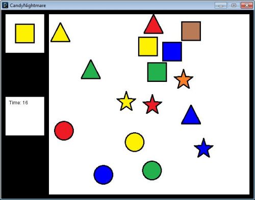
What I ended calling “the first iteration” was the result that was turned in for a hand-in that simply had to show an early digital version of the game. As such, I found it vital to focus on getting the mechanics working, and then adding in graphics later. To get a better idea, take a quick look back on the finalized paper prototype first, to get an idea of how that ended up looking.

The first thing that probably springs to mind is that the background is missing, which I will get back to later. Besides that, the order you had to find the symbols (or, as was the intention of the game: candy pieces) was fixed. The most important thing was that there was a reaction when pressing the correct symbol, and a new one could be picked. Furthermore, the symbols on the board would be randomly placed between each played game, and would never overlap (that would simply make it too silly with a background as well, potentially making it impossible to spot a given symbol).
Second Iteration: Noticing the Details
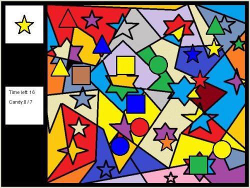
Now, to get back to the background, it was obvious from a little testing and feedback from others that it made a huge difference. It actually seemed to make people find the pieces around double as fast as I had experienced it from the paper version, amazingly enough. As such, I figured that adding a background at this point would be a crucial addition to see if it was simply a result of going digital, or a mouse was simply that much faster than pointing with your fingers. Either way, the result after adding the background was as below.

Besides that, the random order of symbols was fixed, and a few descriptions was added here and there, along with more statistical data once the game was over. As a bonus, this game is also currently online at this link: Candy Nightmare v0.2 (direct link to .jar-file here).
It seems that the current average is around 4 seconds left. I am also very aware that there are some various bugs and odd typographical errors, but that will naturally be fixed for the “final version”, along with the graphics. Yes, it will be done soon. Very soon.
EDIT: Removed link to the outdated version of the game. See here for the “final” prototype.


Permalink